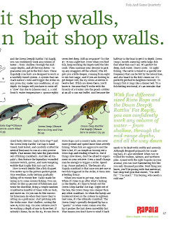
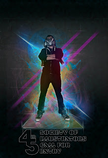
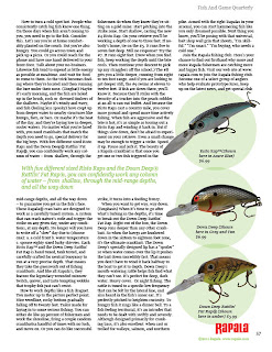
Another all nighter down and another batch of class work revisions. I worked on the Rapala Layout, The Point Of Purchase cut outs (2 different tagline ideas), the Energy Drink label, logo, tagline, packaging, and back story, the Society of Illustrators Call For Entries Poster, ramen Noodle layout, and the Ad series for Chili (re tasked posters from Wick Fowler Chili since those and the label have been approved.) You can click on all these for larger images of the designs. Hopefully Rusty's red pen doesn't find to much to mark on this time. My favorite thing to work on so far has definitely been the SOI poster. It just came together practically by itself. I'm really happy with the 45th, the display fonts used, and the photoshop front. The set up for the poster is a 4 color run on one side, and a 2 color on the other. I love using Photoshop, It's probably where I am strongest at as far as designing and program use goes, so this one was a blast for me to work on. I still need to work in the fold down mailer aspect to it, however one can only do so much in one night. As far as the other stuff goes the ad's came together fairly nicely (and in my opinion work better as those than posters). All that's left with those is to convert them to a 2 color run (black and another color). Outside of that we'll see how it goes in class today. More to come, as always.
fresh subline
A Breath of Fresh Air in an Otherwise Stale Culture.
Monday, April 11, 2011
Wednesday, April 6, 2011
Vis Com II Revisions
Updates, updates. Welp I was sick most of the weekend and into monday. So I missed class, BUT I got a lot done because of being sick this weekend. Besides banging out an art history paper (sweet) I got started on the up and coming projects, and have been fairly ahead in this class. The Rapala project is coming along. The POP will be a cut out of the illustration I did (which I revised last time I was in class).
This is one of the new projects. Design a drink company, product, labels, logos, packaging for it, etc. The concept behind this one is that an architect was up late one night working on a project and needed something to keep him up and focused. So he mixed together juice, caffeine pills and whatever else and now this product was what he mixed, presented to the consumer as an energy drink that will give you the extra push to turn your rough drafts into realities. Below are some initial logo's and such that I went through and below those is a more polished concept idea.
Ramen Noodle Revisions. It's getting there.
Chili. I'm pretty satisfied with these and I think they're really working. It was just a matter of focusing in more on the photo and increasing the text size. Hopefully rusty approves as well.
Subscribe to:
Posts (Atom)


