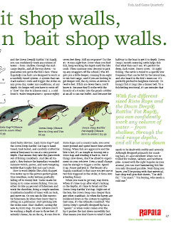
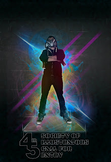
Another all nighter down and another batch of class work revisions. I worked on the Rapala Layout, The Point Of Purchase cut outs (2 different tagline ideas), the Energy Drink label, logo, tagline, packaging, and back story, the Society of Illustrators Call For Entries Poster, ramen Noodle layout, and the Ad series for Chili (re tasked posters from Wick Fowler Chili since those and the label have been approved.) You can click on all these for larger images of the designs. Hopefully Rusty's red pen doesn't find to much to mark on this time. My favorite thing to work on so far has definitely been the SOI poster. It just came together practically by itself. I'm really happy with the 45th, the display fonts used, and the photoshop front. The set up for the poster is a 4 color run on one side, and a 2 color on the other. I love using Photoshop, It's probably where I am strongest at as far as designing and program use goes, so this one was a blast for me to work on. I still need to work in the fold down mailer aspect to it, however one can only do so much in one night. As far as the other stuff goes the ad's came together fairly nicely (and in my opinion work better as those than posters). All that's left with those is to convert them to a 2 color run (black and another color). Outside of that we'll see how it goes in class today. More to come, as always.


