For this final Blog submission (WOO HOO!), I am presenting what I feel are my best 4 designs from this semester and my best 3 designs from last semester. Total this semester we have been assigned 231 hours of work. I have taken 123.7 to design all of the assigned projects. Overall this was an eye opening semester for me in my designs, because I had a large issue with concept generation. I learned a few new program techniques, but I have made leaps and bounds in being able to generate better ideas and work better in that area. The following are what I feel are the best depiction of this.
For my audio booklet project we were allotted 15 hours, however this project only took me 4 hours to complete. It came together fairly easily and I am really happy with the results. I had a good concept form the beginning and tried to keep it consistent throughout. I went with a non traditional CD case (opens from right t left in stead of left to right) to mimic the content in the book and how everything is taught to you backwards (ministry of over, 2+2=5, etc. etc.). This piece was basically just measuring and figuring out folds breaks etc, and then breaking up the content accordingly to coincide with reveals and the order in which the reader would arrive with the info. I didn't really have a whole lot of difficulty with this piece, another one that just kind of came together in and of it self and I'm really satisfied with it.
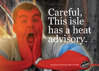
For Wick Fowler we were allotted 21 hours to complete the project parameters and I did it in 10. This project was difficult for me as far as taglines and conceptualiztion goes. Coming up with poster taglines took me the longest. This project was the second most time intensive due to me, considering the amount of pieces that it entailed, and work involved in creating nutrition facts, logos, and taglines. This was also the first time that I used myself as an aspect for a project, especially so outright. This was in fact the first project where I used self shot photography, which was an interesting change. It was a fun thing to tackle though however.
My favorite thing to work on so far has definitely been the SOI poster. It just came together practically by itself. I'm really happy with the 54th, the display fonts used, and the photoshop front image. The set up for the poster is a 4 color run on one side, and a 2 color on the other. I love using Photoshop, It's probably where I am strongest at as far as designing and program use goes, so this one was a blast for me to work on.I'm also happy with how the reveals turned out and the layout on the back. This poster was alloted 15 hours and I did it in 9. As I said, one of my favorites.
For the Herpetology club poster, I had a semi easy time concept wise with this one, however getting taglines to go with it was a real struggle for me on this poster. It took forever and I wound up using my first tagline I came up with, with the addition of 3 words (funny how a couple words can make or break a tagline. ) I don't normally use sex sells on things, however the prospect of nerds and supermodels was too much to pass up. I feel like I could have been more efficient with the tagline development, however I learned some better ways to brainstorm them and think that I will do better on future projects. Total this piece took 2 hours to complete. Our budget was 6 hours. I really like the clean design and simplicity of this piece as well. Definitely color wise this was how I like to design (black and white with one or two additional colors.)

The following pieces are the smokey series. These pieces were a lot of fun, however the challenge was being original and not doing the same ads that have been done before. I did some custom photoshop work for the center images and did a lot of type massaging and tagline editing for these. Total these pieces took 4 hours to do. Again I also had issues with tagline generations and conceptualization on these, however I worked through it and got to a good point on these that I'm happy with. Our budget was 6 hours.
For the stress magazine layout, this piece was ALOT of text revisions and massaging. I really like how all the text works together in this piece and the use of imagery and pull quote. I had issues with headline arrangement and placement of imagery, however after numerous revisions I came to a good final arrangement. This piece took 7.3 hours to complete, our budget was 12 hours.
Study Abroad booklet. This was the most time intensive piece we did as far as just general layout and in program work went. It was just a lot to handle and try to work with, and required separating everything into pieces and taking it a step at a time to get to a finalized product. We were budgeted 45 hours and I completed this project in 27.5. The first thing I did was pick a color scheme and work with that as far as text and headlines and vectors goes. From there I set standard as far as my page appearances went and used the same grid structure, placement, and appearance for each section. That made this piece much easier to work with. I'm happy with how this piece turned out and really like the overall appearance.


